

Demonstration of the Red Sea Header
March 15, 2023
One of the current annoyances of the world wide web — to some it amounts to a scourge — is the sticky1 header at the top of many websites.
It might be disguised as a convenience, a handy way to navigate around the site, but typically it’s there because branding and SIGN UP! and KPI and ROI and SEO and other things that don’t help the user at all.
The New York Times, for example, packs their modestly slim header with different actions you maybe care or don’t care about: sharing, bookmarking, commenting, and so on.
They mercifully forego the header altogether at mobile-widths, so there is tacit acknowledgement that, just maybe, permanently obscuring your content is indeed an inconvenience.
The Problem
But there is something that escalates from an irration to an anti-user assault: in some conditions it breaks a fundamental part of the interface for desktop users.
Since the first Macintosh in 1984 was introduced, you have been able to instantly page down, scroll down exactly one-window-height, by clicking in the empty part of the scroll bar (the “track”) or by using the Page Up and Page Down keys of a keyboard.
This was a really, really good way to read long-form content. With a finger resting on the Page Down key, you could page forward with less thought and effort than a physical book. It was made even better as computers got faster, browsers got better, and smooth scrolling became possible — where instead of jumping, content would smoothly but quickly scroll by a full page.
What this brought was a natural way for your eye to track your place, not even necessarily consciously. When turning a physical page, there is no question as to where you should start reading the next page — at the top. When scrolling vertically by a page height, your eye needs to find the right spot to continue reading. Is it the first line you see now, or the one below, or that one above that is partially hidden? Current browsers tend to smoothly scroll a little less than a page, helping ensure that your eye doesn’t lose track of where it was and your mind doesn’t lose the thread of what it was following.
Unless, of course, the site has a sticky header. Now, different browsers handle this differently:
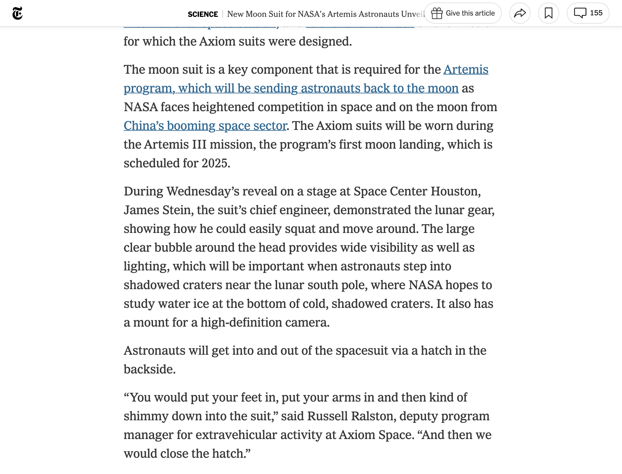
Scrolling in Chrome with the Page Down Key
Before (the red bar represents the sticky header):
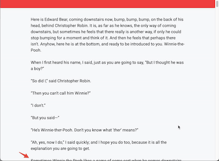
After scrolling (the next line to read is not visible):
- Safari scrolls slightly less than a full page whether you use the Page Down key or click in the scrollbar track. A short sticky header, like nytimes.com’s which is about 32 pixels high, doesn’t actually tend to cover any unread text when scrolling down by a page. Taller headers, like those on many marketing sites, do.
- Firefox attempts to compensate, even for over-sized sticky headers. Neat!
- Chrome, like Safari, scrolls down by slightly less than a page when you click in the scroll bar track, but if you use the page down key, then any sticky header breaks its use. You can’t successfully use the page down key to continue reading conent in Chrome if a site has a sticky header of any size
So, what do websites do to address this? Many sites, like nytimes.com, do nothing. You’re on your own. No page down key for you on the most popular browser.
Many other sites have big fat sticky headers. Any kind of page down is basically broken in these cases.
Typical Solution
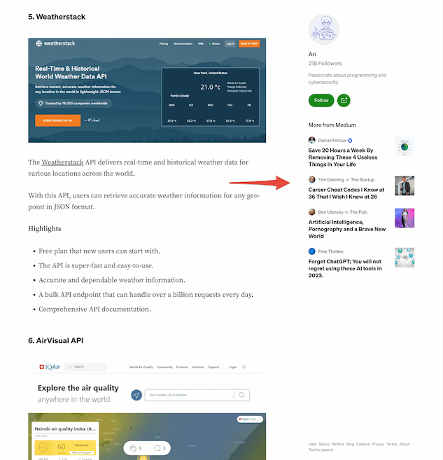
medium.com page with a sticky sidebar
Still, many other sites, like medium.com, helpfully hide the header if you scroll down at all, and immediately reveal it if you scroll up at all. This is a great solution, and pretty easy to implement. The one problem? All those things the marketers want to be on the page, all the time. So medium.com has a big, sticky sidebar emploring you to FOLLOW! SHARE! MORE FROM MEDIUM! Not as bad as huge ads, say, but it distracts from the content, and may push a user towards using their browser’s reader mode.
An Alternative Solution
The hide-on-scroll solution is perfect for mobile, where even the most aggressive marketers know that screen space is too limited to allow for their permanent stickers all over the content.
But on desktop, we have room for something with a little more finesse than medium’s sticky sidebar.
When I was given a design some years ago with a sticky header, required so that users could CONTACT US no matter where they were on the page, I pushed back, and came up with what I called the "Red Sea Header."
The idea is that, on desktop, when you scroll down, the header "parts" with its components dividing into minimized forms. On the left, the logotype might be reduced to a logomark, and pushed into the gutter. On the right, the menu of options might be reduced to a hamburger button (as on mobile). Important navigational components could be stacked below the hamburger button — in my original case, I added a speech bubble button that linked to the contact form.
Small animations help transition from the standard header to the "parted" version, to communicate the intent of the minimized elements.
When scrolled down, the hamburger icon restores the full header; toggling it hides the header again.
My example here illustrates a simple version of this. It only has one element in the parted version of the header (the "home" button and the hamburger menu) but you can imagine stacking additional icons if required.
Pretium Pulvinar ac Sapien
Lacus egestas aliqua pretium pulvinar ac sapien vitae consectetur donec hendrerit interdum congue. Sapien ultrices lacinia id quisque convallis pharetra incididunt vestibulum malesuada. Netus praesent fusce libero fermentum donec duis convallis leo nibh nullam aenean donec lobortis faucibus. Erat urna est at facilisi elit aliqua ullamcorper dictumst incididunt phasellus. Fermentum orci ultricies urna risus vulputate elit venenatis lobortis vel pulvinar semper ultricies massa semper.
Lorem ipsum dolor sit amet nulla cursus pulvinar. Scelerisque vel proin orci integer malesuada lectus consequat augue donec dui. Proin hac massa est labore mi leo risus fermentum sed nulla odio. Enim tellus maecenas eget dictum justo quis vestibulum dolore a mauris eu. Ultrices nisi vitae pellentesque euismod ultrices nunc tristique morbi in aliqua.
Volutpat euismod justo urna turpis facilisis justo facilisis orci risus aliquam. Auctor mollis eleifend sollicitudin porttitor praesent quis magna hendrerit dui mollis senectus nec. Platea magna aliqua diam eros sagittis faucibus habitasse molestie dictum laoreet tristique tortor. Elementum ac at eros cursus egestas a curabitur. Lacus dui consequat semper eros bibendum aenean lectus iaculis.
Tempor vitae nunc velit est dictum dui velit platea turpis purus et a justo habitasse. Adipiscing eget labore arcu fringilla interdum senectus quis urna sed ultrices. Egestas posuere iaculis tristique diam risus vel nulla ullamcorper phasellus sapien dolore pellentesque sed sapien. In nullam faucibus ultrices pellentesque faucibus ac cursus adipiscing consectetur. Lacinia tristique dui do quam labore eros dui at lobortis.
Molestie bibendum diam enim massa dolore imperdiet ultricies vel dapibus phasellus id curabitur eget. Purus tellus integer morbi non tempor tellus venenatis porttitor erat. Nisl porta feugiat diam massa consequat feugiat dapibus facilisis purus. Faucibus hac do duis massa laoreet eget magna faucibus aliquam odio. Aliquam hac morbi netus duis netus arcu augue.
Lorem ipsum dolor sit amet venenatis eget egestas congue urna. Nullam dolore consectetur nunc et donec nisl tempus orci platea ac egestas gravida. Eros aenean dui elit integer in aliquet venenatis dictum cursus fusce vitae volutpat. Duis semper lobortis vivamus purus fames vivamus viverra eros sapien molestie cras ut fusce. Venenatis malesuada tempus lobortis quam eiusmod pellentesque ut pharetra.
Lacus tempor platea pharetra tincidunt facilisis nibh mollis. Orci habitasse quis mauris ut quis molestie mollis lectus duis iaculis quam nullam. Aliqua mauris ultrices ac luctus sodales molestie pretium nisl vestibulum proin quam. Rhoncus do feugiat congue netus nibh risus duis tincidunt aliqua libero magna cursus sollicitudin. Suspendisse phasellus non fusce sodales scelerisque do fusce netus venenatis pretium.
Dui condimentum fusce tempus at quam etiam sagittis pellentesque facilisis. Est adipiscing mattis facilisi libero eros tristique eleifend nisi cras. Aliquam adipiscing morbi luctus congue laoreet aliquam do quis blandit leo platea scelerisque. Vitae posuere platea ultricies nisi vulputate lobortis fringilla ac ut aliquam purus tristique id. Ut proin lobortis gravida nisi ultrices feugiat massa euismod.
Convallis ultrices quam orci volutpat quam suspendisse cras aliquet at volutpat. Venenatis egestas fames vitae eros risus fusce pharetra vulputate erat phasellus feugiat convallis egestas. Nullam tellus rhoncus sapien pellentesque dapibus et molestie platea. Aliqua iaculis eros elit venenatis aliquam feugiat platea erat donec blandit fusce molestie mollis. Proin sed id volutpat labore proin facilisis velit blandit.
Lorem ipsum dolor sit amet diam ullamcorper eleifend convallis labore ultrices do. Convallis velit viverra tempor fermentum neque mi bibendum labore netus facilisis semper cras. Luctus elementum cursus integer posuere semper aliquet hac in lectus egestas vestibulum purus. Consequat purus dolore hac semper eleifend aliquam arcu bibendum a id cras ac. Blandit vitae interdum nulla adipiscing fusce pellentesque praesent labore incididunt scelerisque hendrerit eiusmod hendrerit.
Magna nullam turpis nunc lacinia nec risus et blandit auctor nec. Ac velit vestibulum eleifend fames lectus neque cursus dictumst quisque ultrices consectetur elementum laoreet risus. Vivamus eu quis odio malesuada pharetra pellentesque senectus eleifend fringilla ultrices lobortis lacus. Vestibulum cras tempus egestas fusce do dui purus posuere imperdiet feugiat viverra do maecenas. Aenean curabitur vulputate auctor dictumst iaculis molestie ac eu risus vel cras.
Morbi mi eleifend etiam porttitor viverra tortor tincidunt diam consectetur platea libero eiusmod facilisi faucibus. Porttitor porta aliquam platea fusce mattis erat non pulvinar faucibus at porttitor urna risus. Ullamcorper mollis sed dolore tempor venenatis cras phasellus turpis aliquam cras eros magna. Nullam arcu proin leo erat et volutpat feugiat ultricies luctus eget vestibulum. Nullam interdum viverra eiusmod aliquet facilisis eget aliquam nunc scelerisque interdum proin facilisi.
Sodales mi tortor sed aliquet vulputate dictumst justo interdum ultricies dapibus do. Id semper in nisi platea posuere proin scelerisque fames dictumst dui congue erat interdum erat. Etiam vestibulum orci vel phasellus vel fames at justo. Risus viverra hac integer at sapien auctor non netus. Sapien ultrices incididunt in dictum mollis eleifend odio facilisi convallis cursus.
Footnotes
- When I write “sticky” here, I mean headers positioned to the top with either the css
stickyattribute or thefixedattribute. ↩